
Eliminating Operational Friction through Strategic Design
Role
Sr. Product Designer
Timeline
8 weeks
Platforms
iOS / Android
Overview
Unlocking Operational Efficiency
Key Results
1.89x
Increase in average card usage for physical and online purchases during the first 3 months.
22%
Users who transitioned from inactivity to performing transactions within the first quarter.
-38%
Reduction in help center contacts related to account operations.
+16%
Increase in average balance for active accounts 3 months after the redesign.
The Situation
The Inactivity Enigma

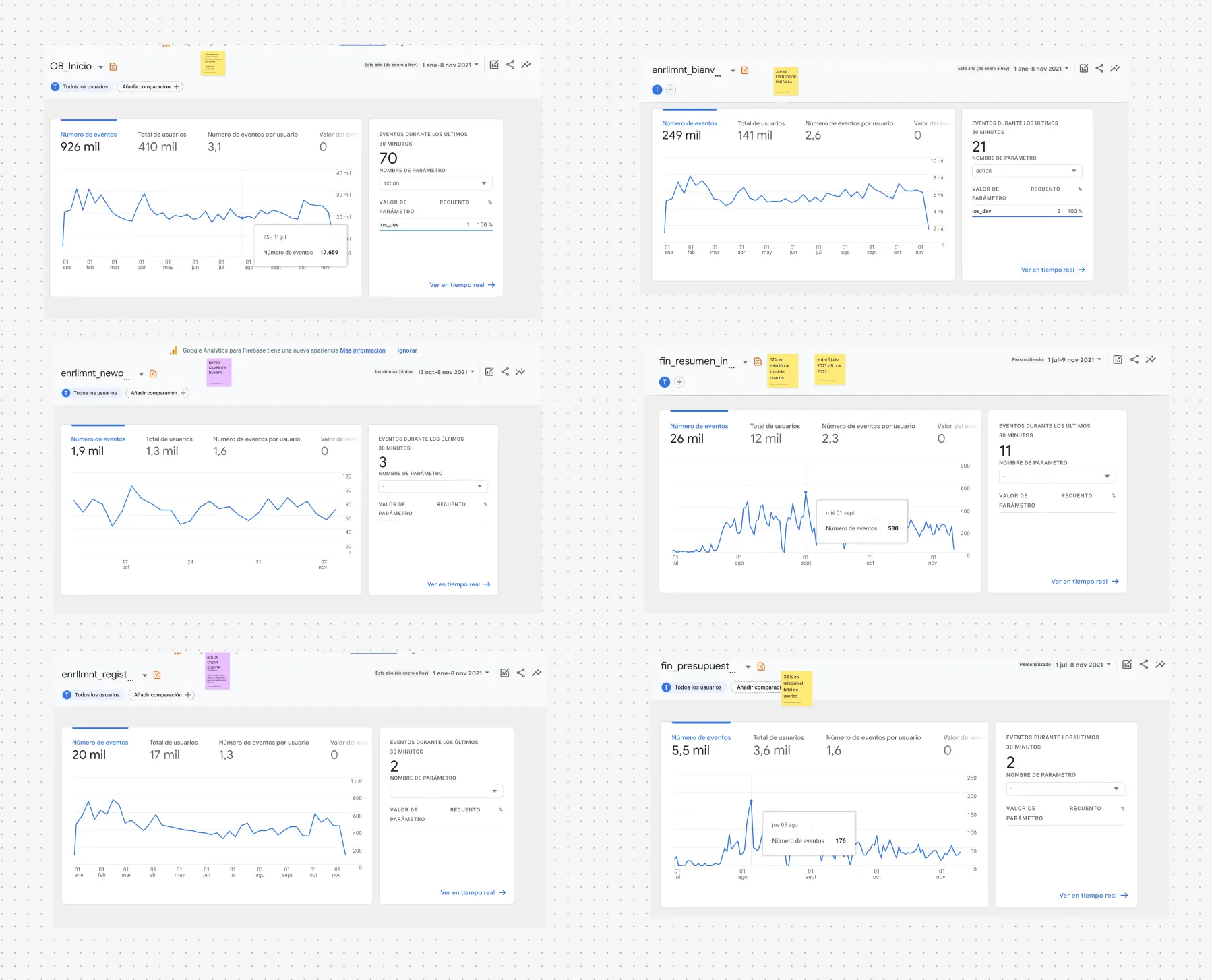
Discovery
The numbers were clear, but the reasons weren't
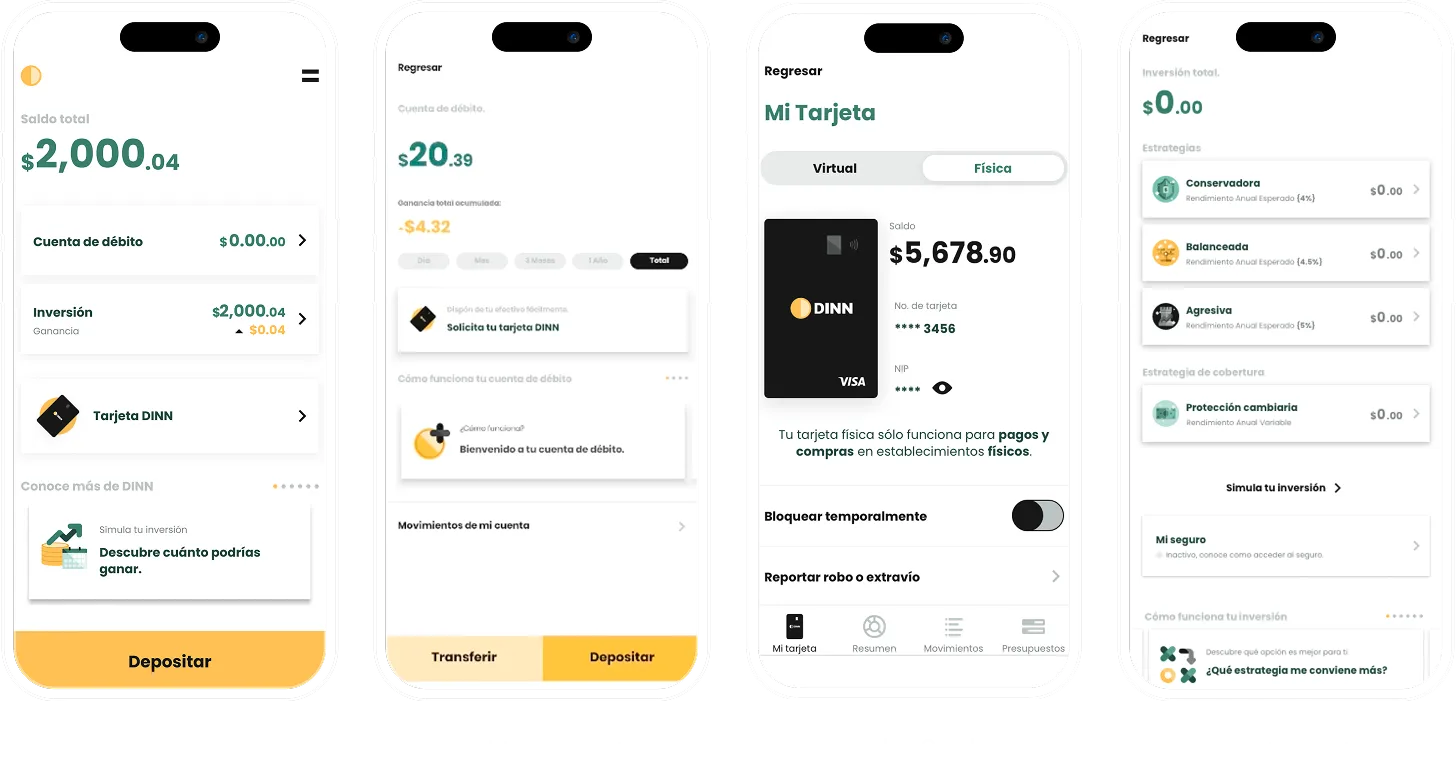
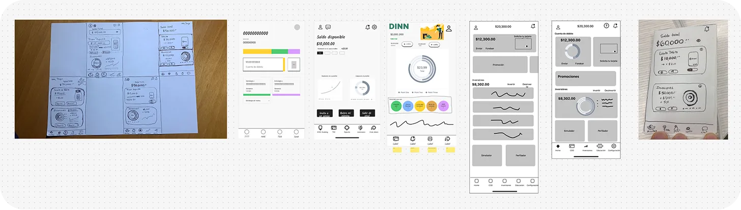
Main screens previous experience
Key Findings
Structural Blockers
1. Balance Ambiguity
The "Total Balance" combined investments and cash, creating a false illusion of immediate liquidity for the user.
2. Fragmented Ecosystem
Account and Card operated as isolated silos, breaking the perception of unified control over money.
3. Inconsistent Navigation
Lack of UI patterns. Intermittent menus and buttons repositioned across screens broke the learning curve.
4. Passive Design
Monitoring-centric interface lacking quick actions. It acted as a passive viewer, not a financial engine.
Definition
Omnichannel Triangulation
To prove that these frictions were causing churn, I crosstabulated Firebase analytics with complaint volumes from stores and technical support. The data validated our hypothesis and provided additional insights.

Main Findings
63% friction due to design and understanding
The vast majority of tickets originated from the interface. Key complaints involved hidden features and the inability to link cards and accounts.
Frustration and Technical Failures
Reviews confirmed massive confusion regarding balances. They also exposed abrupt session timeouts that destroyed user trust.
Data Debt and Cognitive Loops
We detected a circular navigation pattern: users repeatedly entered and exited the same screens with no clear way out.
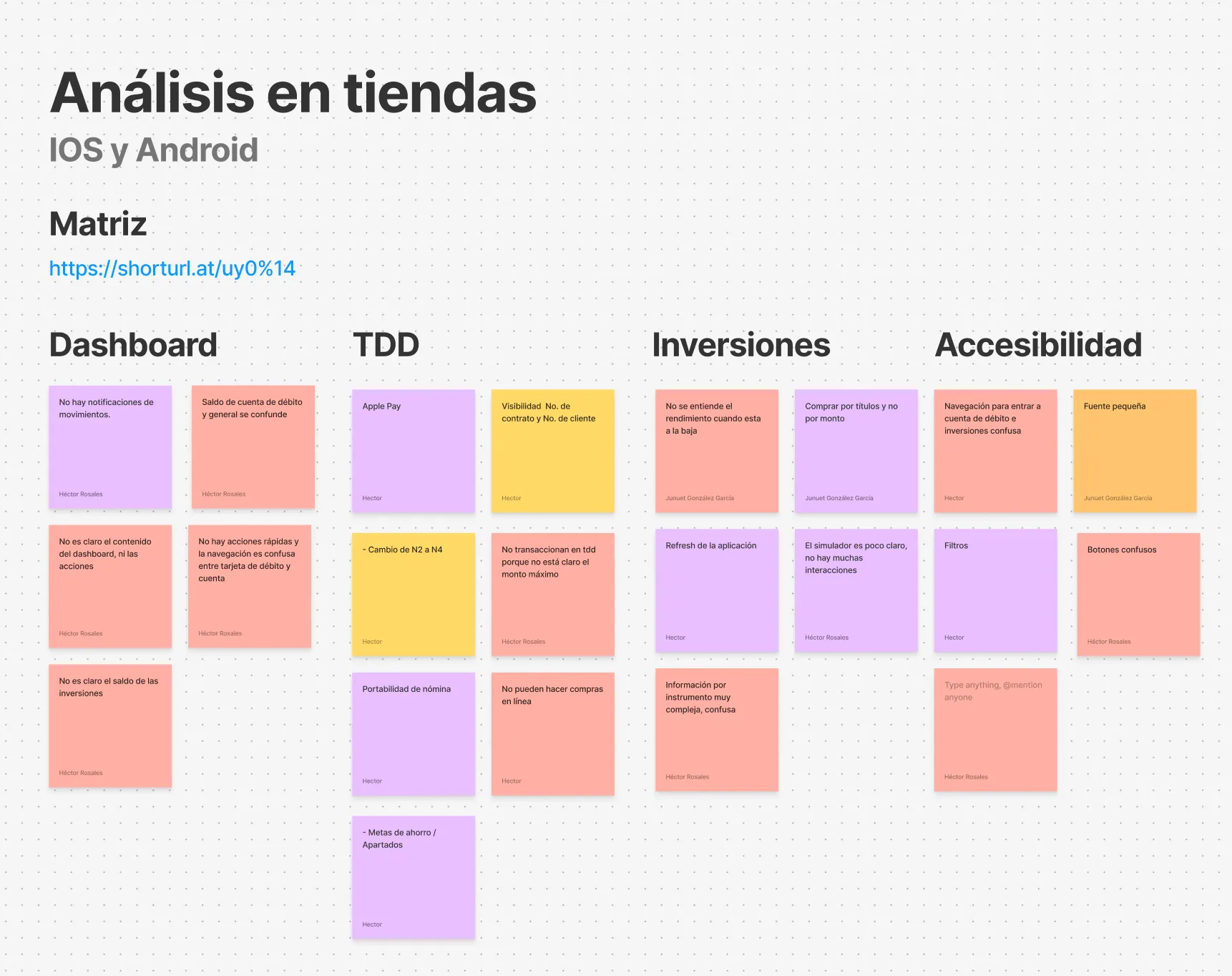
Analysis across iOS and Android stores, covering more than 1,500 reviews.
Event analysis in Firebase with over 120k records.
Ideation
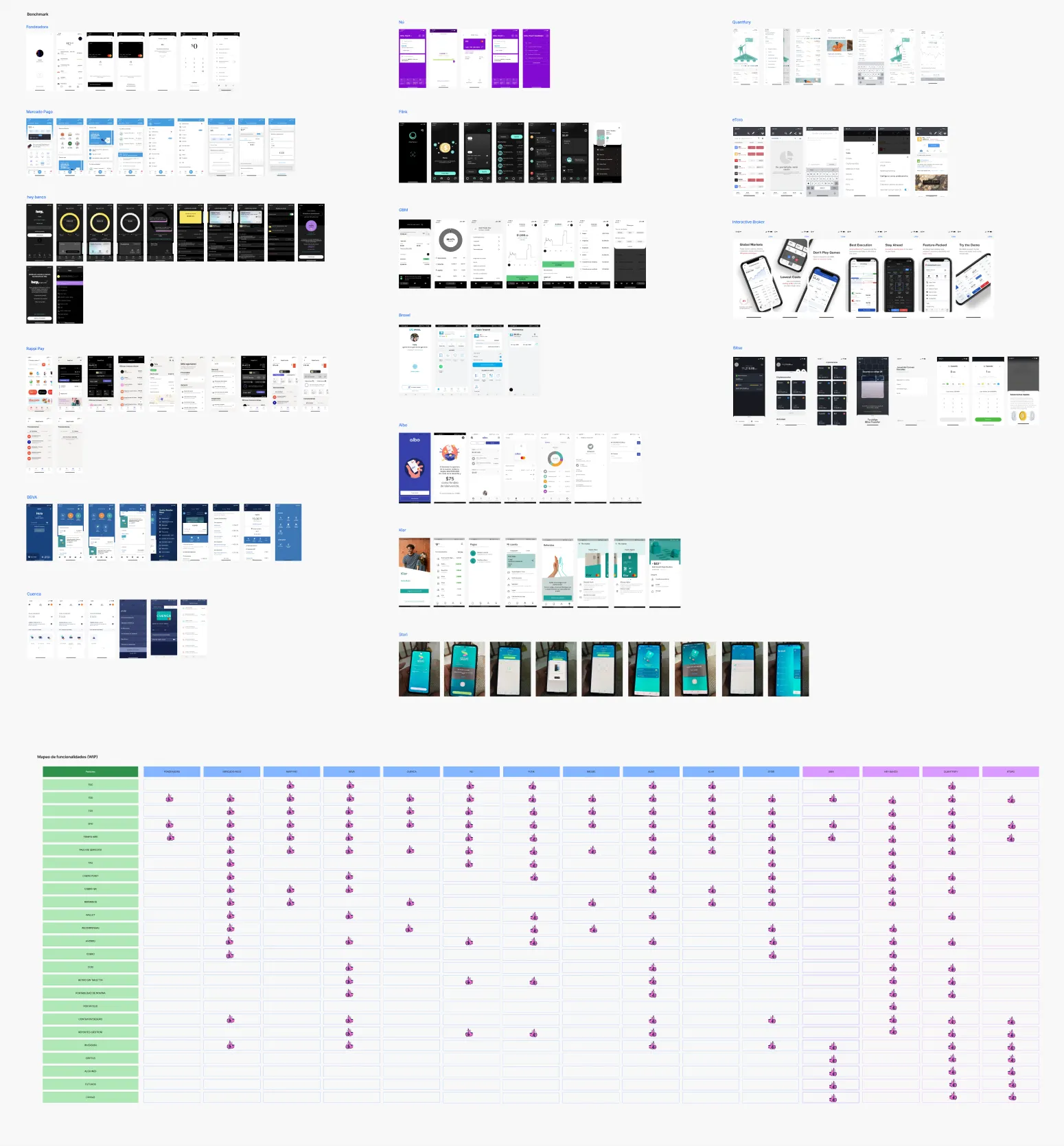
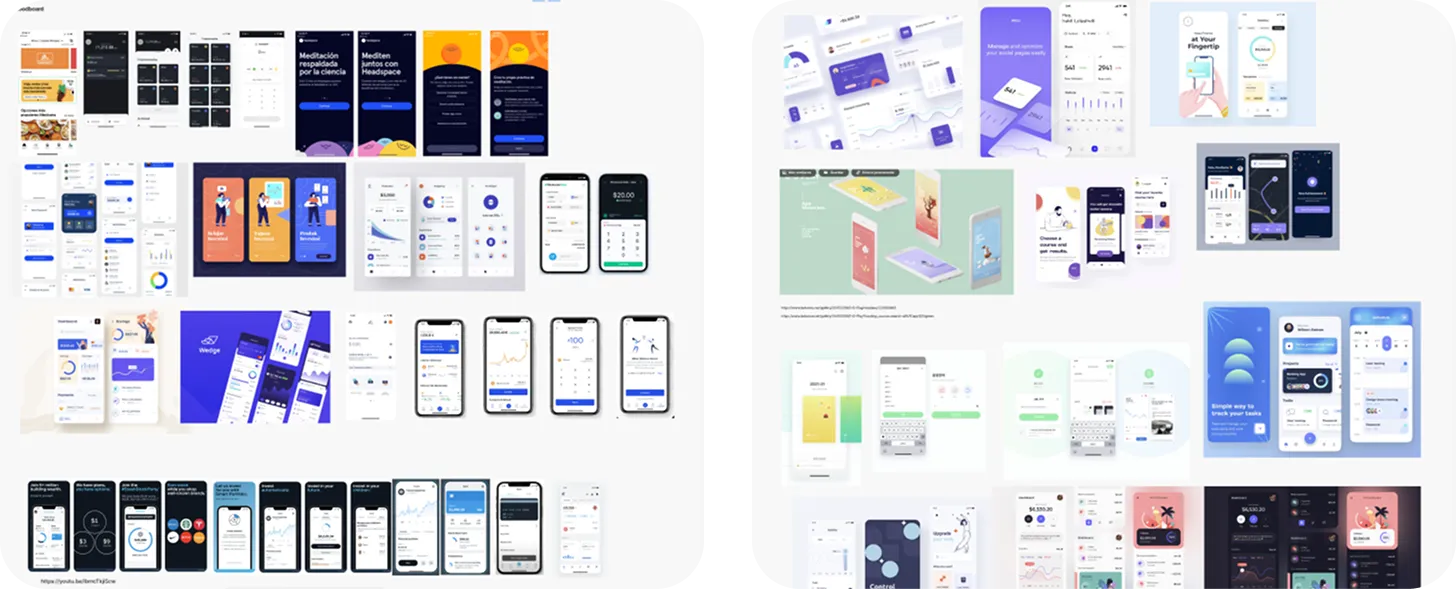
How does the industry solve this?
With fragmentation and false liquidity diagnosed, the next step wasn't to reinvent, but to observe.
I analyzed over 12 apps (banks, fintechs, and investments) to understand how the market manages the coexistence of operational cash and invested capital.
The goal: map navigation standards and adopt the mental model that users already master.
Ideation
Strategic Design and Iteration
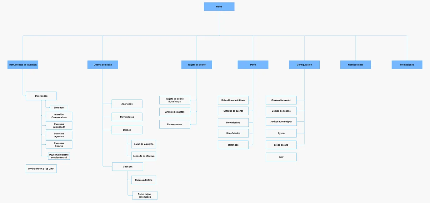
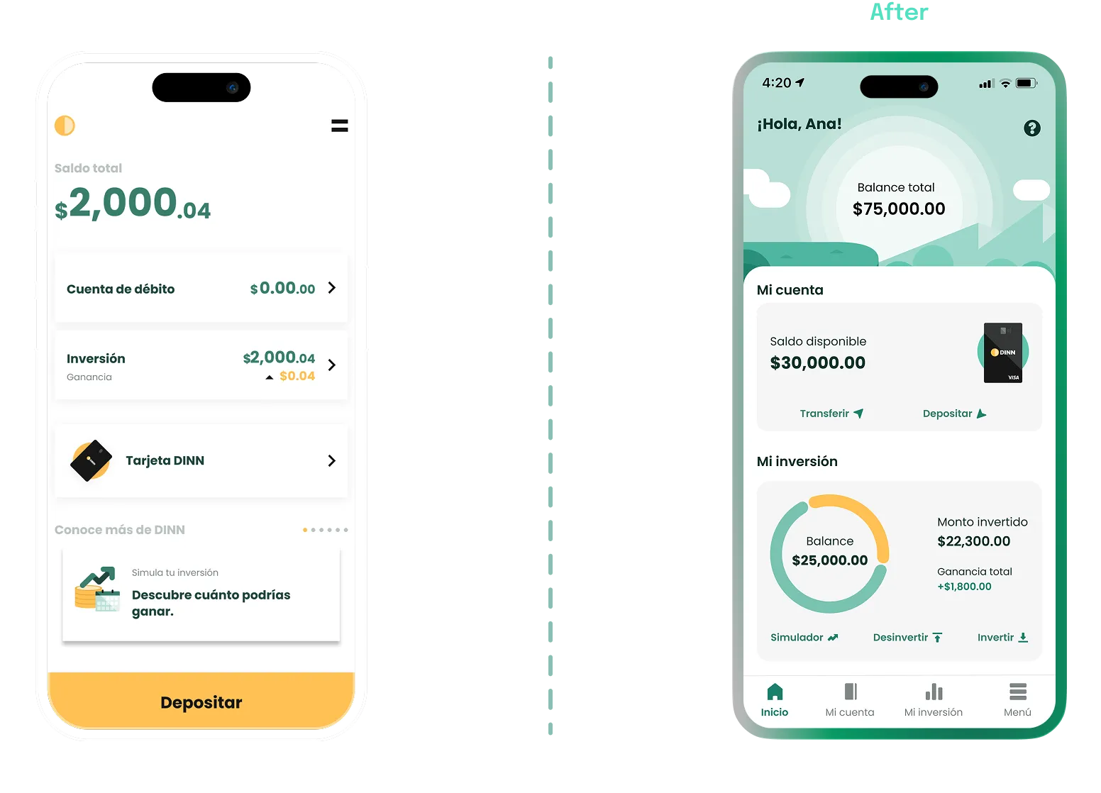
First unified architecture proposal, designed to resolve fragmentation.
Using the triangulation findings as a foundation, I designed an initial unified architecture proposal. My goal was to merge the worlds of Account and Card into one, grouping core functions by pillars.
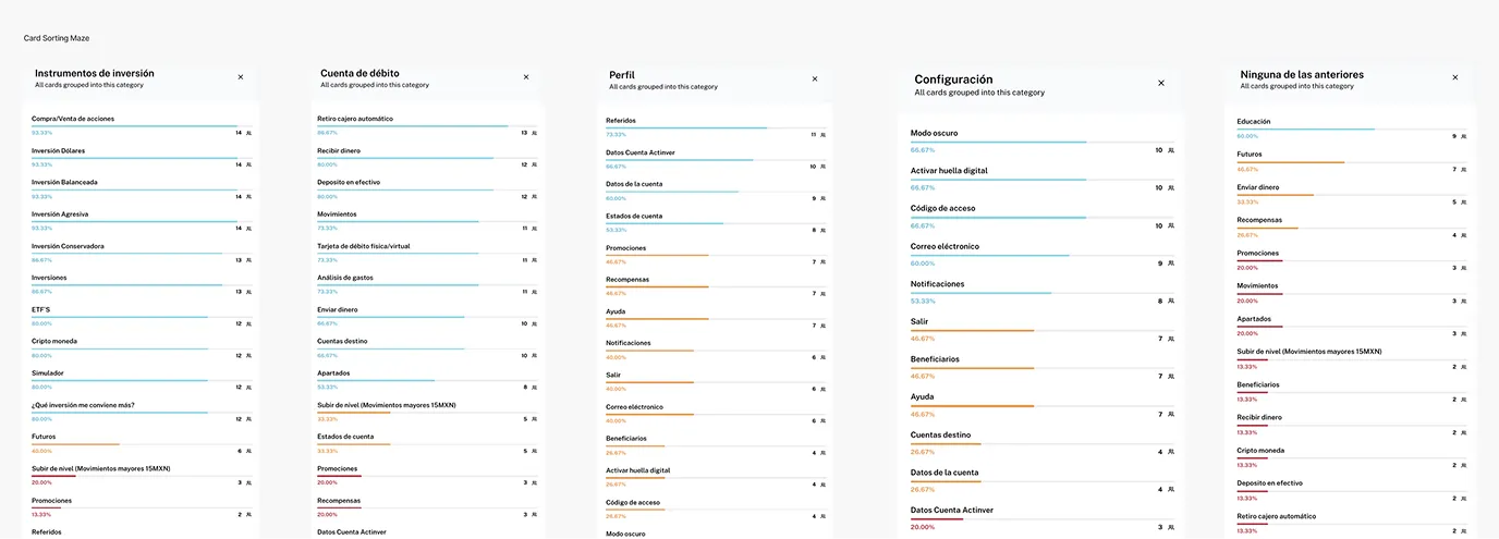
Maze Card Sorting test: Validating grouping patterns and hierarchy.
We put this proposal through a Card Sorting test in Maze. We evaluated whether users grouped tasks and information as intended, searching for real hierarchy patterns.
Test Results
Core Pillars
86% separated investment from account. We restructured the foundation by dividing the ecosystem into Growing and Liquid Money.
Progressive Disclosure
Secondary functions cluttered the flow. We removed them from the main menu, showing them only contextually.
Unified Ecosystem
Separating account and card confused users. We merged both into a single operating environment to restore control.
Centralized Profile
88% looked for settings in their profile. We centralized all adjustments there, eliminating isolated menus.
Iteration
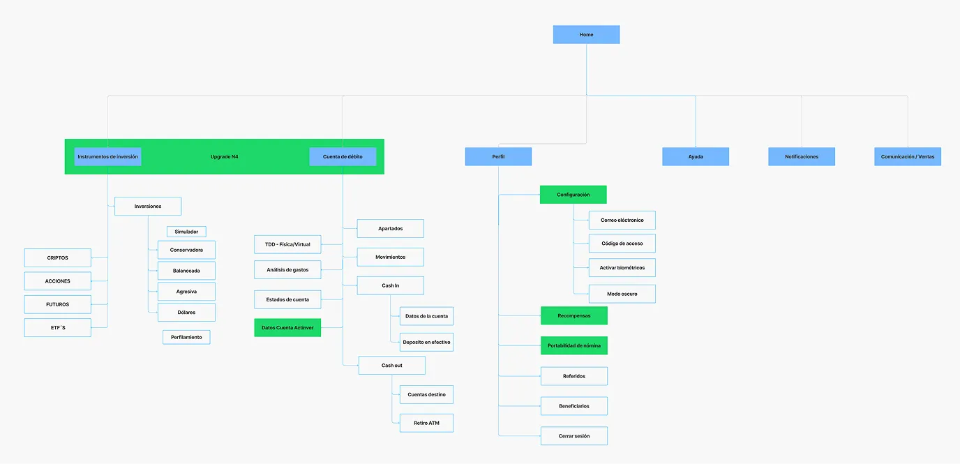
Iteration on the initial proposal, including data-driven improvements.
Ideation
Bringing everyone to the table
To ensure the viability of the improvements, I organized an interdisciplinary workshop. The goal wasn't to design the final interface, but to use the exercises as a catalyst for conversations between Tech, Product, and Business.
This allowed me to discover true constraints, technical effort, and business vision, giving us the confidence to move into the UI phase knowing it was 100% achievable and aligned with all stakeholders.
Ideation workshop to align Tech, Product, and Business perspectives.
Ideation
Defining the Visual DNA
Exploring styles and visual references to define the product's identity.
I used collaborative moodboards to align visual expectations with stakeholders. This exercise not only defined the Look & Feel but also established the product's personality based on three non-negotiable pillars:
Human
Friendly interactions that eliminate traditional banking coldness, creating empathy with every tap.
Memorable
Distinctive visual accents to stand out in a fintech market saturated with clones.
Simple
Zero visual noise. Every element has a reason for being, keeping the focus on financial control.
Testing
Validation with real users
We tested the final UI with 15 users across various socioeconomic segments. The goal was to ensure the new experience was clear, intuitive, and solved the initial pain points regardless of income level or financial literacy.
Architecture
87% navigated without friction between account and investments. The confusion from the previous version completely vanished.
Mental Model
Separating Available Money from Invested Wealth provided immediate clarity and eliminated financial anxiety.
Investment Autonomy
The new feature cards fulfilled their educational mission; users were able to choose their strategy without technical barriers.
Operational Efficiency
Quick actions reduced required taps, prioritizing transactional agility over passive exploration.
Frictions and Barriers
Identifying pain points is the true value of testing. We obtained three critical insights before the final hand-off:
The Language Barrier
Terms like "Annualized Return" caused anxiety. Users didn't want to read financial theory; they just wanted to know "how much am I going to earn".
The Strategy Stopper
Descriptions for each investment type overwhelmed beginners. Instead of providing security, too much information paralyzed decision-making.
The Balance Error
Labeling different amounts simply as "Available Balance", "Invested Balance", etc., continued to confuse users about their actual liquidity for daily spending.
Delivery
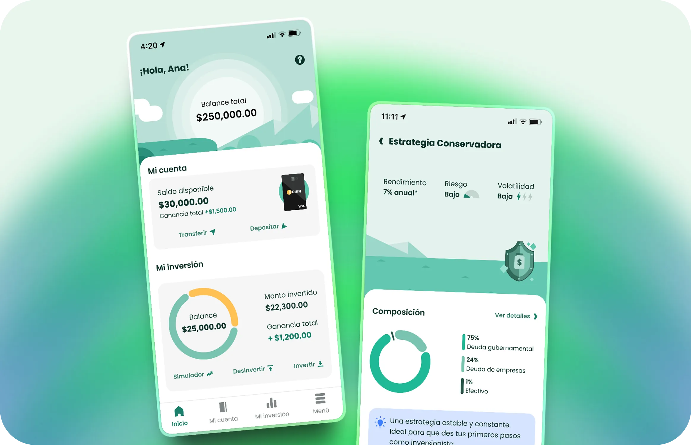
Final Solution
With validated pain points, we refined the approach before finalizing the design. The final UI doesn't just modernize the Look & Feel; it addresses financial anxiety, simplifies decision-making, and resolves balance hierarchy.
We divided the screen into three key concepts: Total Balance (wealth), Available Balance (liquid cash), and Invested Amount. This provides absolute clarity on capital distribution from the first fold.
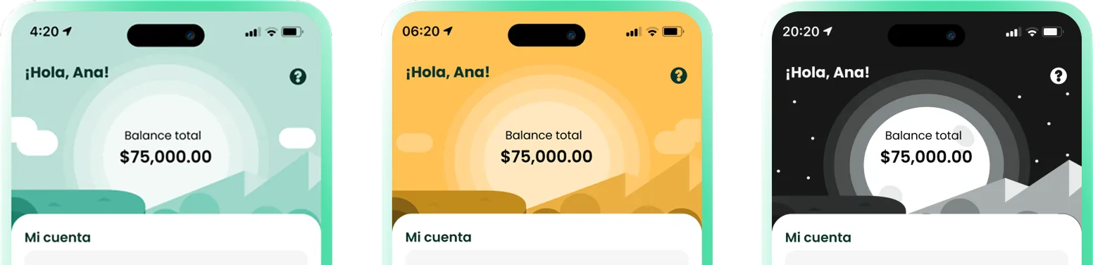
To humanize the experience, we designed a dynamic environment that evolves with the circadian cycle. This detail transforms the interface into a living ecosystem, enhancing immersion and emotional connection.
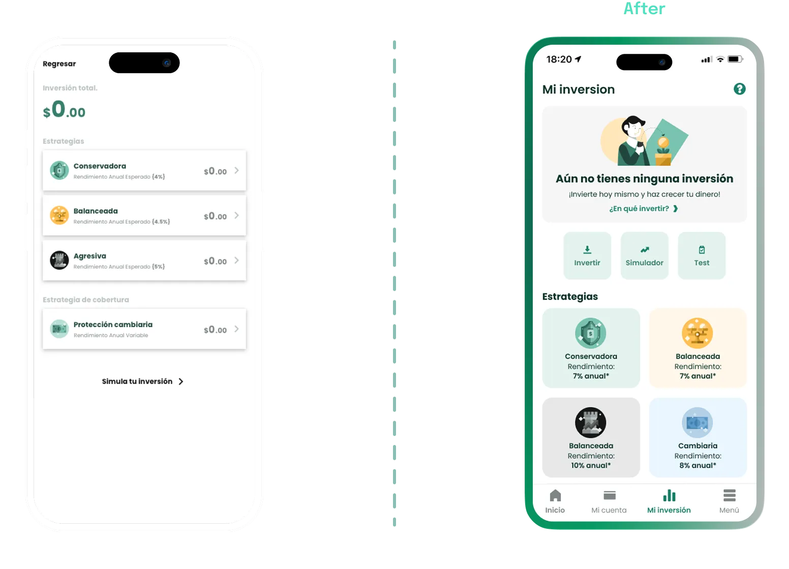
I redesigned the empty states to function as learning bridges, offering context and clear actions that invite users to discover the value of each tool before committing their money.
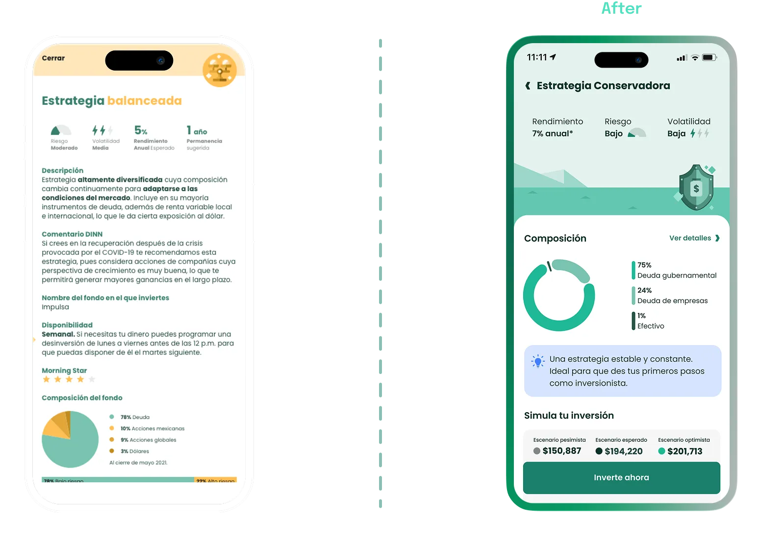
We replaced walls of text with educational tips . By giving center stage to strategy composition and the simulator, we enable users to understand their returns dynamically.
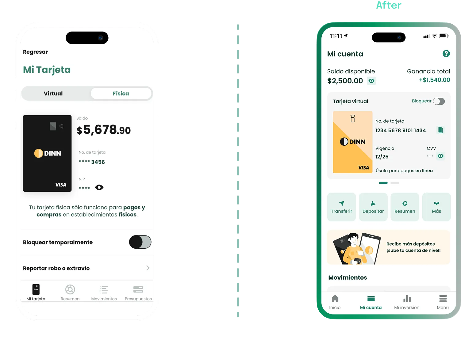
We merged the account and card views into a single screen. By centralizing data and quick actions under Available Balance, we restore financial context and drastically reduce transactional friction.
Key Takeaways
Clarity Drives Conversion
In the financial ecosystem, trust is earned through simplicity, not extra features. I discovered that educating users via the interface is the most powerful engine for ensuring product adoption.
Design as an Operational Bridge
My greatest value was aligning Business, Tech, and Product. Anticipating technical constraints through design not only reduced friction but also accelerated a commercially viable delivery.
Evidence-Based Decisions
Real data kills subjectivity. Using testing findings and metrics allowed us to iterate with precision, eliminating resource waste and focusing on what truly adds value.
Thanks for sticking around!
If you enjoyed the process or want to dive deeper into any part, let’s chat.